Apple Mail redesign: a mobile-first UX exploration.
Design sprint from problem discovery through 0 to 1 design and interactive prototype. Bridging the gap between Mail's IA and modern user mental models.
Apple Mail
With over 2.5 billion users and a nearly 58% global market share, Apple Mail is the world's most used email client. However, unlike "destination" apps like Gmail, it functions more as a mailbox inventory aggregator.
Better UX leads to ecosystem retention.
Reducing friction within core utilities lowers the incentive for users to migrate to third-party competitors.
A modern, intuitive mail experience reinforces the premium value of the native iOS suite, strengthening overall brand loyalty.
Improved information architecture allows users to triage communication with higher precision and lower cognitive effort.
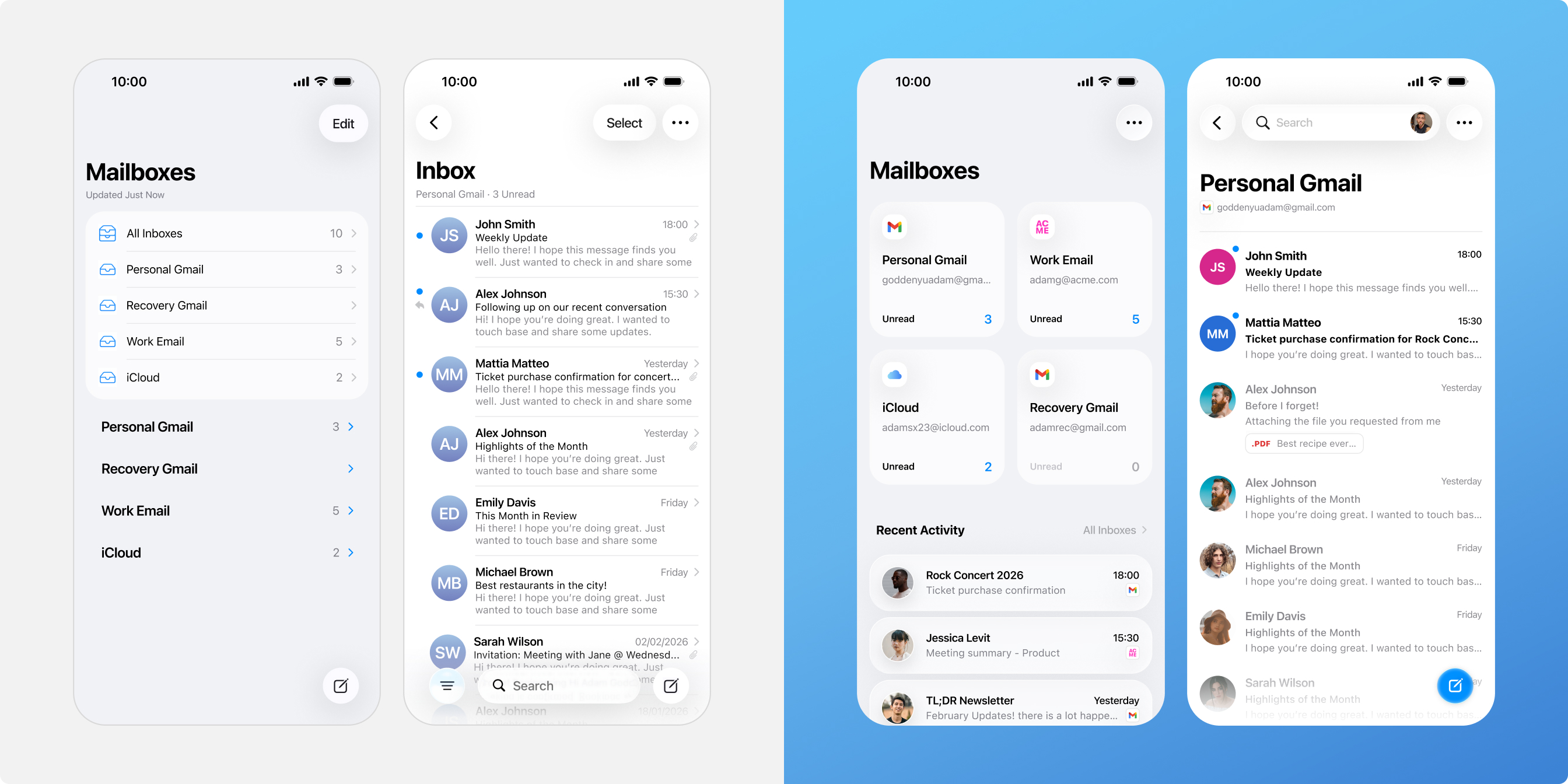
Users don't think in "All Inboxes", they think in context.
Information density without hierarchy is just noise.
Flat Visual Hierarchy
A lack of typographic weighting and clear UI anchors makes it difficult to quickly scan for importance, recency, or relevance across multiple accounts.
System-Centric IA
The navigation reflects server-side folder structures rather than user mental models. This misalignment increases cognitive load and friction during daily navigation.
Ecosystem Churn
These usability gaps drive users toward third party alternatives like Gmail. This weakens Apple's core goal of keeping users engaged within its native ecosystem.
Effective visual hierarchy and UI anchoring drive instant recognizability, converting a wall of data into a scannable interface.
Gmail Inbox

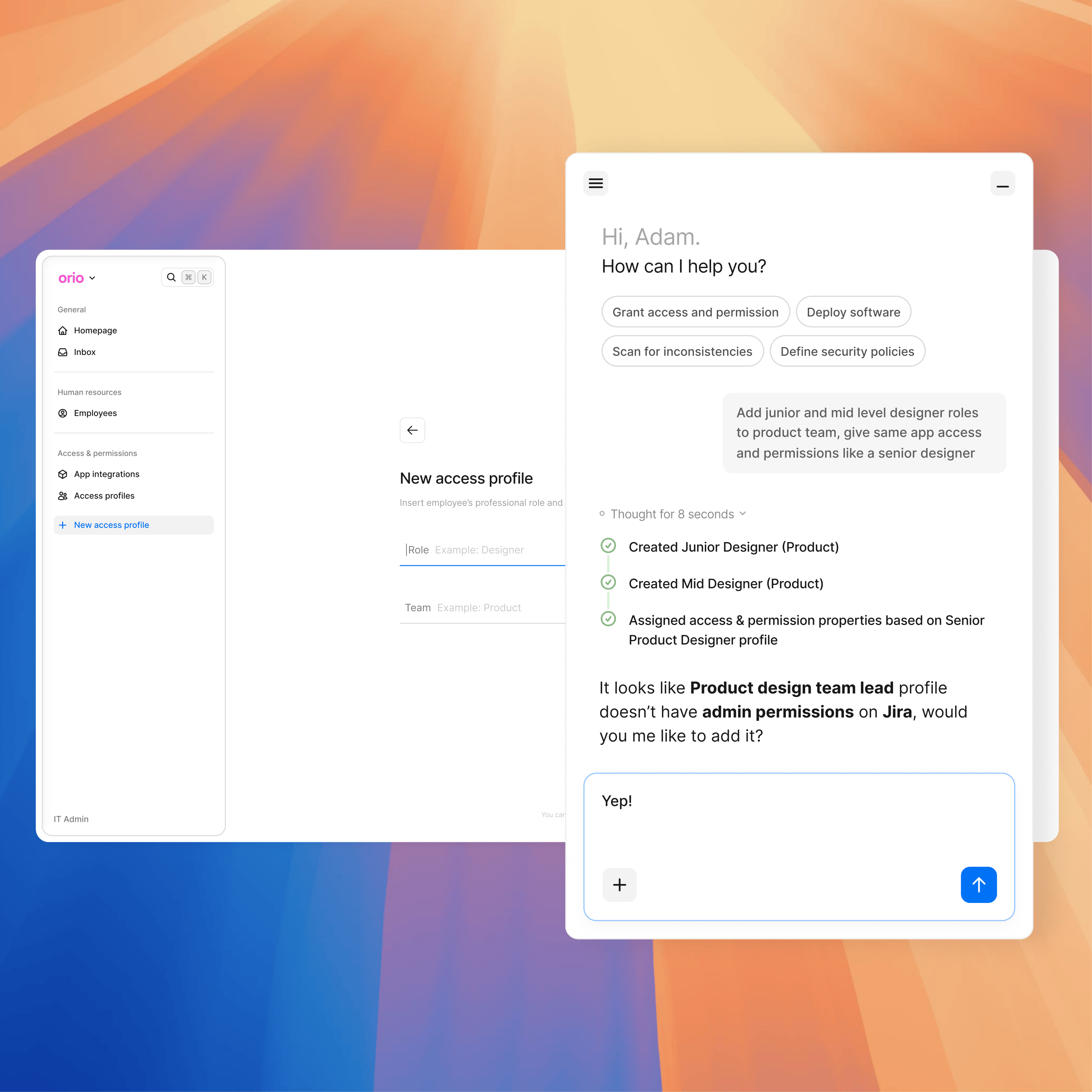
Apple Mail or iMessage app?

From technical inventory to intent-based navigation.
Contextual Entry Points
Promoted "Single Inboxes" as the primary navigation tier. This allows users to immediately decide where to focus their attention before they even begin reading.
Dynamic "Recents" Feed
Demoted the generic "All Inboxes" view in favor of a curated "Recent Activity" feed. This transforms a static list into a high-priority stream of the latest interactions.
Weighted Visual Hierarchy
Introduced high-contrast avatars and refined typographic weighting. These UI anchors support rapid scanning, helping users distinguish between a critical thread and a newsletter at a glance.
Beyond the sprint: Solving for scalability.
Multiple Account Management
The average user manages 1.86 accounts, and power users handle 3 or more. The system is built to stay fast and clear even as users add more personal and work accounts.
Density Control
To manage high email volume, Display Settings (S, M, L) let users change the layout size. This keeps the UI clean and readable regardless of the screen size or how many emails they get.
Custom Placement
Moving away from fixed lists, Modular Placement lets users pin, reorder, or hide inboxes. This creates a personalized setup that fits their specific way of working.
Explore other projects
Data Lineage: from overlooked feature to primary SaaS converter.

Intent-based trading: driving growth and performance through behavioral design.